
Many people try to sell their products online but struggle to get sales because their pages do not clearly explain the value or guide visitors to take action. This is where a Sale Page Template becomes very helpful.
Without a clear structure, your message can confuse people and make them leave without buying. A good sale page template shows you exactly what to write and where to place it so your page looks simple, clear, and convincing.
In this blog post, you will learn how a sale page template works, what sections to include, and how to use it step by step to turn visitors into happy customers.
Tip#1 Powerful Headline
Imagine you’re walking through a busy market. Many stalls are shouting for your attention.
What makes you stop at one? Often, it’s a catchy sign, right? On the internet, your sales page headline is that sign.
It’s the very first thing people see. It decides if they stay on your page or click away.
A Powerful Headline grabs attention instantly. It makes people curious. It tells them, in a few words, what your product or service can do for them.
This is super important because you only have a few seconds to make that first impression.
Your headline isn’t just a title. It’s a promise. It hints at the solution to a problem your reader has. It should speak directly to their biggest desire or their deepest pain point.
For example, instead of “Learn to Cook,” a powerful headline might be “Cook Delicious Meals in 30 Minutes, Even if You Hate Cooking!” See the difference?
The second one addresses a problem (hating cooking) and offers a clear benefit (delicious meals in 30 minutes). It’s specific and focuses on the reader’s outcome, not just the product itself.
There are a few key ingredients to a powerful headline. First, it should be clear. Don’t try to be too clever or vague. People need to understand it right away.
Second, it should be benefit-driven. What will the reader gain? How will their life improve? Third, it should create curiosity.
Make them want to read more. Fourth, it can include a number or a specific timeframe, like “5 Steps to X” or “Achieve Y in 7 Days.”
Numbers make promises feel more concrete and achievable. Finally, it should be unique. Stand out from the crowd.
Think about your ideal customer. What are they searching for? What words do they use to describe their problem?
Use those exact words in your headline. This makes them feel like you truly understand them. It creates an instant connection.
A good headline acts like a filter. It attracts the right people and gently pushes away those who aren’t a good fit.
This saves you time and effort. It ensures you’re talking to people who are genuinely interested in what you offer.
Remember, the goal of your headline is to get them to read the first sentence of your sales page.
Tip#2 Subheadline
After your powerful headline grabs attention, the Subheadline steps in to do more work. Think of it as the headline’s helpful assistant.
While the main headline hooks them, the subheadline gives a little more detail. It expands on the promise of your main headline.
It helps to clarify what your product or service is all about. This is your chance to give a bit more information, without overwhelming the reader.
It’s a crucial bridge between the attention-grabbing headline and the main body of your sales page.
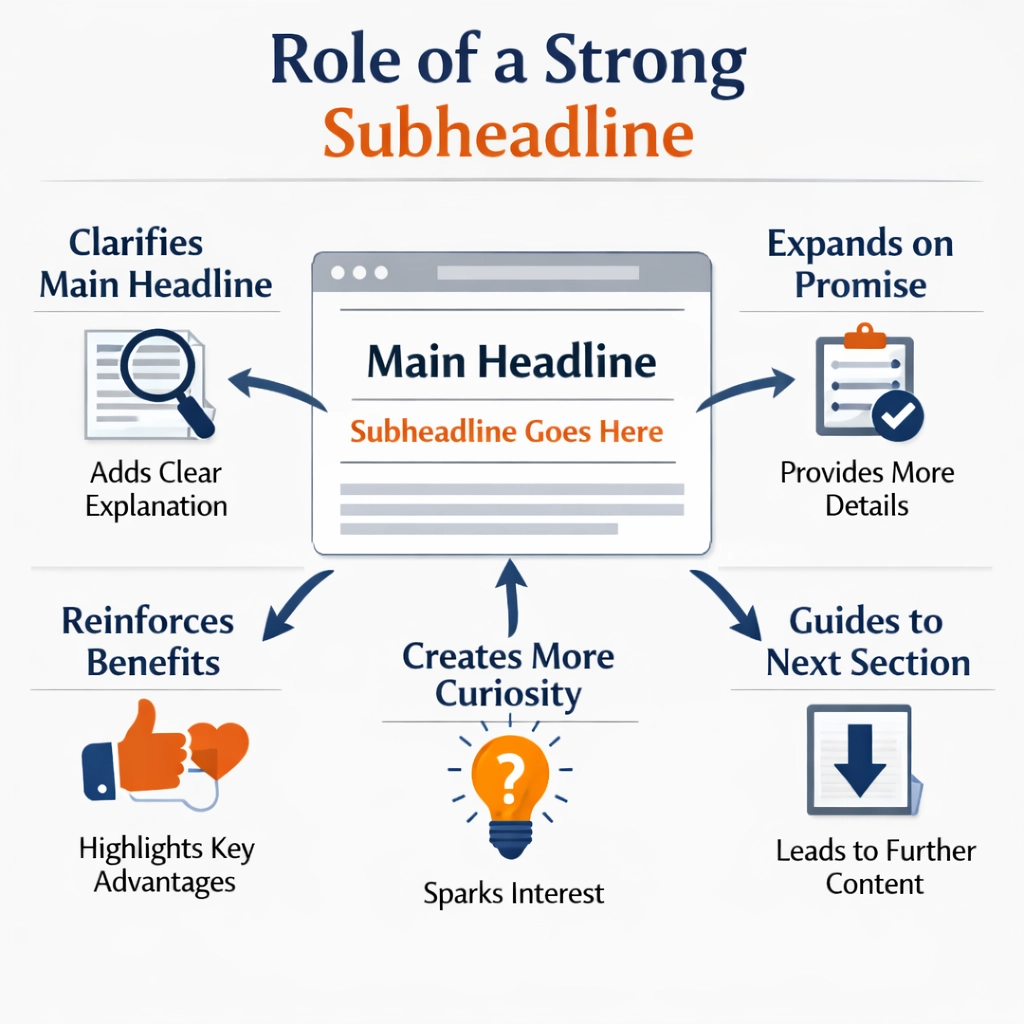
The subheadline’s job is to keep the reader engaged. It should make them want to read the next section. It often explains how the main headline’s promise will be delivered, or who it’s specifically for.
For example, if your main headline is “Cook Delicious Meals in 30 Minutes, Even if You Hate Cooking!”, your subheadline could be: “Discover simple, step-by-step recipes that turn kitchen chaos into culinary confidence for busy parents.” This adds more context. It makes the offer even more appealing to a specific group.
An effective subheadline is usually longer than the main headline, but still concise. It’s typically one or two sentences. It should be easy to read and understand.
It should also reinforce the main benefit. It can also introduce a unique selling proposition (USP) that wasn’t fully captured in the main headline.
For instance, if your main headline is about saving money, your subheadline might mention how you save money, like “…without sacrificing quality or spending hours on research.”
It’s important that your subheadline works hand-in-hand with your main headline. They should feel like a team. They should tell a consistent story. If your headline promises one thing and your subheadline talks about something else, you’ll confuse your reader.
Confusion leads to clicks away from your page. So, make sure they flow together naturally.
The subheadline is your second chance to make a strong impression and draw your reader deeper into your sales message. It sets the stage for the rest of your sales page content.
Tip#3 Identify the Problem
After you’ve grabbed attention with your headline and subheadline, the next crucial part of your sales page is to Identify the Problem. This is where you show your reader that you truly understand them.
You talk about the struggles, frustrations, or desires they have. It’s like saying, “I know exactly what you’re going through.” This step is super important because people buy solutions to their problems.
If they don’t feel you understand their problem, they won’t believe you have the right solution. I always tell my clients: before you can sell the cure, you must first describe the pain.
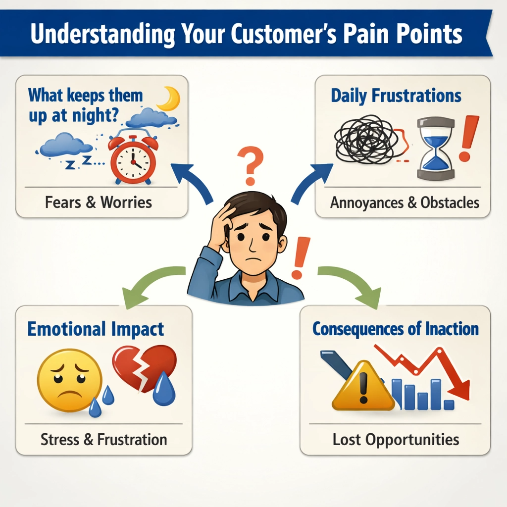
Think about your ideal customer again. What keeps them up at night? What challenges do they face every day? What are their biggest headaches related to what you offer?
For example, if you sell a course on time management, the problem isn’t just “not enough time.” It’s the feeling of being overwhelmed, missing deadlines, or not spending enough time with family. It’s the stress, the guilt, and the lost opportunities.
You need to paint a vivid picture of this problem. Use descriptive words that evoke emotion. Make the reader nod their head and think, “Yes, that’s exactly me!”
When you identify the problem, you’re not just stating facts. You’re tapping into your reader’s emotions. You’re showing empathy. This builds trust.
It makes them feel heard and understood. You can use questions to engage them, like “Are you tired of…?” or “Do you often feel…?” These questions make them actively think about their situation.
They pull the reader deeper into your sales message. The more accurately you describe their problem, the more they will believe you have the answer.
It’s also important to highlight the consequences of not solving this problem.
What will happen if they continue on their current path?
Will they keep losing money, feeling stressed, or missing out on opportunities? This creates a sense of urgency. It motivates them to seek a solution.
But be careful not to scare them too much. The goal is to show them the reality of their situation, not to make them feel hopeless.
You want to gently guide them towards the idea that a solution is possible, and that you have it.
By clearly identifying the problem, you set the stage for your product or service to be the hero. You create a need in the reader’s mind.
They realize they must find a way out of this problem, and your sales page will soon offer that way.
This section is not about selling yet; it’s about connecting with your audience on a deeper level and validating their experiences. It’s the foundation upon which you will build your solution.
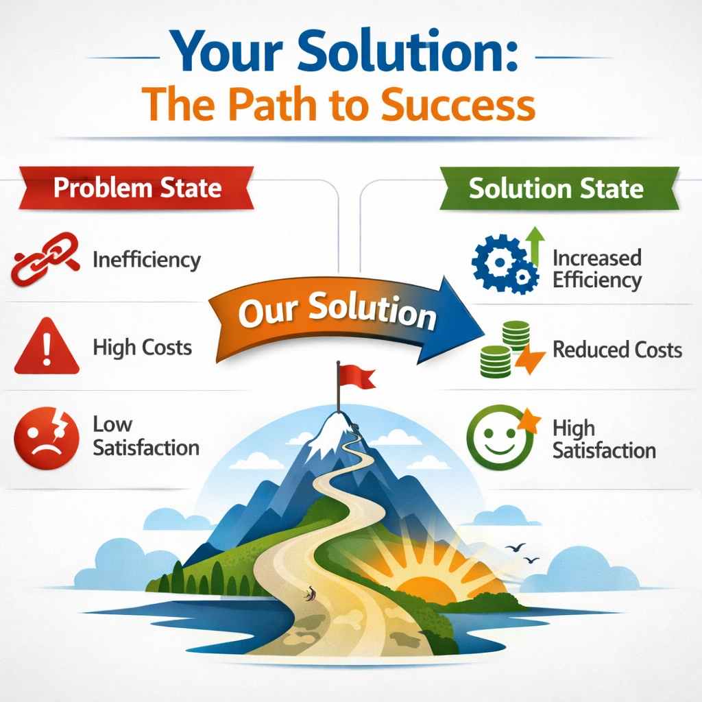
Tip#4 Introduce the Solution
After you’ve clearly identified your reader’s problem and made them feel understood, it’s time for the big reveal: Introduce the Solution. This is where your product or service steps onto the stage as the hero.
You’ve shown them the pain, now you show them the way out. This section is not about listing every single feature.
Instead, it’s about presenting your offering as the perfect answer to the problems you just highlighted. It’s about painting a picture of relief, success, and transformation.
I always advise my clients to focus on the outcome your solution provides, not just what it is.
Think back to the problem you described. If your reader is overwhelmed by time management, your solution isn’t just a “time management course.”
It’s the “Stress-Free Productivity System” that helps them reclaim their evenings and achieve their goals.
You need to connect your solution directly to their pain points. Show them how your product or service directly addresses each of the frustrations they feel.
Use clear, simple language. Avoid jargon that might confuse them. The goal is to make them think, “Yes! This is exactly what I need!”
This part of your sales page should be exciting and hopeful. You’re shifting the reader’s mindset from problem to possibility.
You can use phrases like “Imagine a world where…” or “What if you could…?” to help them visualize a better future with your solution.
Briefly explain what your solution is (e.g., “a comprehensive online course,” “a personalized coaching program,” “a powerful software tool”), but quickly pivot to what it does for them.
How does it make their life easier, better, or more successful? This is where you start to build excitement and desire.
Highlight the unique aspects of your solution. What makes it different or better than other options they might have tried or considered? Is it faster, simpler, more effective, or more supportive? This is where your unique selling proposition (USP) shines. You don’t need to go into deep detail yet; that comes later.
For now, keep it high-level and benefit-focused. You want to give them enough information to understand the core value and feel optimistic about the change it can bring. This section is about building anticipation for the deeper dive into your offer.
Tip#5 Show the Benefits
After you’ve introduced your solution, the next critical step on your sales page is to Show the Benefits.
This is where you move beyond just telling people what your product or service is and start explaining what it will do for them.
People don’t buy products; they buy better versions of themselves. They buy solutions to their problems and the positive feelings that come with those solutions.
This section is all about painting a vivid picture of the improved future your customer will experience. I always emphasize that features tell, but benefits sell.
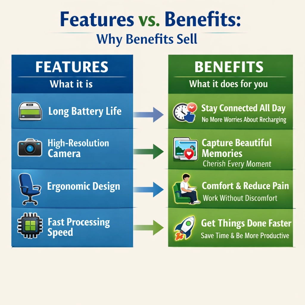
Think about the difference between a feature and a benefit. A feature is a fact about your product. For example, a course might have “10 video modules.” That’s a feature.
The benefit of those 10 video modules could be “You’ll learn complex topics quickly and easily, without feeling overwhelmed.”
The benefit explains why the feature matters to the customer. It answers the question, “What’s in it for me?” Your sales page should focus heavily on these benefits.
List them clearly and make them easy to understand. Use bullet points to break up the text and make it scannable.
Each benefit should directly address a problem or desire your ideal customer has. If they are struggling with lack of time, a benefit could be “Save 5 hours a week with our streamlined process.”
If they want to feel more confident, a benefit could be “Gain the confidence to speak up in meetings and impress your boss.”
Connect each benefit to a positive emotion or a desired outcome. This helps the reader imagine themselves experiencing that positive change.
It makes the benefits feel real and attainable. Don’t just state the benefit; elaborate on it slightly to make its impact clear.
It’s also helpful to use strong, active verbs when describing benefits. Instead of “You will be able to…”, try “You will transform…”, “You will master…”, or “You will achieve…”.
These words create a sense of empowerment and action. Consider grouping related benefits together. This can make them more impactful and easier for the reader to digest.
For example, you might have a section on “Time-Saving Benefits” and another on “Confidence-Boosting Benefits.” This organization helps the reader quickly find what matters most to them.
Remember, your goal is to make the reader feel like their life will be significantly better after using your product or service.
This section is about inspiring hope and demonstrating value. It’s about showing them the light at the end of the tunnel and how your solution will get them there.
The more clearly you articulate these benefits, the more compelling your offer becomes. This is where you truly differentiate your solution from others.
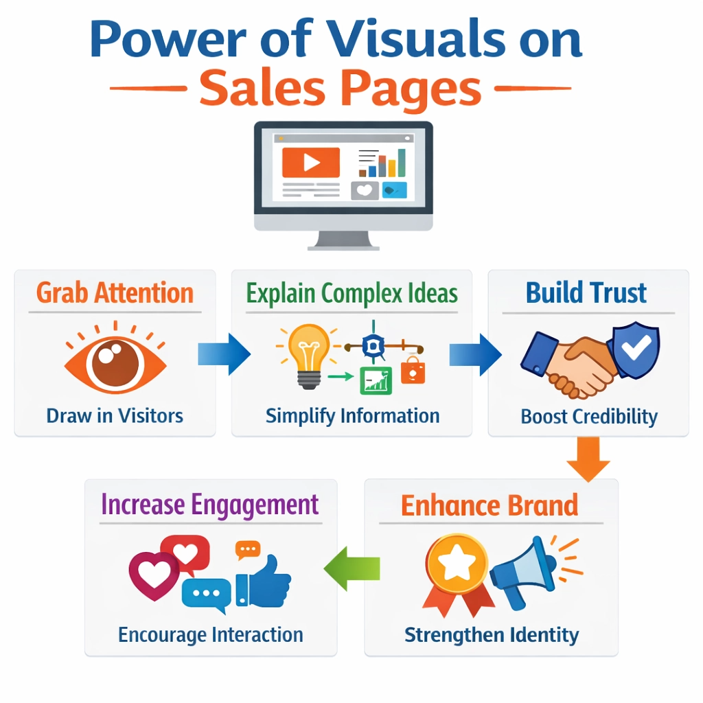
Tip#6 Add Visual Elements
Once you’ve crafted compelling words for your sales page, it’s time to Add Visual Elements. Words are powerful, but pictures and videos make your message even stronger. Think about how you learn best.
Often, seeing something helps you understand it faster than just reading about it. Visuals break up long blocks of text, making your sales page easier and more enjoyable to read.
They also help to convey emotions and build trust. I always tell my clients that a sales page without good visuals is like a book without illustrations – it can be good, but it’s missing something important.
There are several types of visual elements you should consider. First, high-quality images. These could be photos of your product, screenshots of your software, or professional headshots of yourself if you are the face of the brand.
Make sure these images are clear, well-lit, and relevant to your message. Avoid generic stock photos that don’t truly represent your offer.
Second, consider videos. A short, engaging video can explain your product or service in a way that text alone cannot. It can also build a stronger connection with your audience.
A video testimonial, for example, can be incredibly persuasive. Third, use graphics and infographics. These are great for explaining complex ideas simply.
An infographic can break down a process, show statistics, or highlight key benefits in an easy-to-digest format.
Visuals also play a huge role in establishing your brand. They should be consistent with your brand’s colors, fonts, and overall style. This creates a professional and cohesive look.
When choosing images, think about the emotions you want to evoke. Do you want your audience to feel excited, relieved, or empowered? Select visuals that align with those feelings.
For example, if your product helps people save time, an image of someone relaxed and smiling, enjoying their free time, would be very effective. Visuals should not just decorate your page; they should enhance your message and help tell your story.
Don’t forget about white space. This isn’t a visual element itself, but it’s crucial for making your visuals stand out.
White space is the empty area around your text and images. It prevents your page from looking cluttered and overwhelming. It gives your eyes a place to rest.
When you combine strong visuals with plenty of white space, your sales page becomes much more inviting and professional.
The goal is to create a visually appealing experience that guides the reader effortlessly through your sales message, making them feel good about what they’re seeing and reading.
Tip#7 Add Social Proof
After you’ve introduced your solution and shown its benefits, the next powerful element to include on your sales page is Social Proof.
This is evidence that other people have used your product or service and are happy with the results.
Think of it like this: if you’re looking for a new restaurant, are you more likely to try one that’s empty or one that’s buzzing with happy customers?
Most people would choose the busy one. That’s social proof in action. It builds trust and reduces doubt.
It tells your potential customers, “Hey, other people like this, so you probably will too!” I always tell my clients that social proof is your silent salesperson.
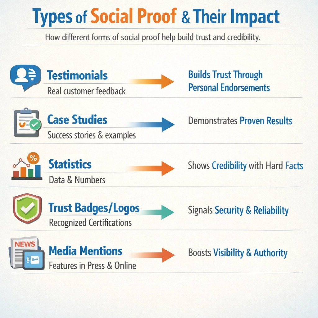
There are several types of social proof you can use. The most common and effective are testimonials. These are quotes from satisfied customers talking about their positive experiences.
Make sure these testimonials are real and include the customer’s name, photo, and ideally, their business or title. This makes them more believable.
Video testimonials are even better because they are harder to fake and convey genuine emotion.
Another powerful form of social proof is case studies. These are in-depth stories that show how a specific customer used your product or service to achieve a great result.
They often include numbers and specific outcomes, like “Increased sales by 50%” or “Saved 10 hours a week.”
Beyond testimonials and case studies, you can also use statistics. For example, “Over 5,000 satisfied customers” or “90% of users reported improved results.” These numbers provide concrete evidence of your product’s effectiveness.
Trust badges or logos from well-known companies you’ve worked with can also serve as strong social proof. If a big brand trusts you, others are more likely to.
Media mentions or features in reputable publications also add credibility. Even showing the number of social media followers or positive reviews on platforms like Google or Yelp can be effective.
The key to using social proof effectively is to make it relevant and easy to see. Don’t bury your testimonials at the bottom of the page. Place them strategically near sections where a potential customer might have doubts or need reassurance.
Use clear headings like “What Our Customers Say” or “Real Results.” Make sure the social proof directly addresses the problems and benefits you’ve already discussed.
It should reinforce your claims and make your solution feel less risky. The more credible and specific your social proof, the more persuasive it will be. It’s about letting your happy customers do the selling for you.
Tip#8 Break Down What’s Inside
After you’ve captured attention, introduced your solution, shown the benefits, and built trust with social proof, your potential customer is now very interested.
They want to know the specifics. This is where you Break Down What’s Inside. This section is all about clearly outlining every component of your product or service.
It’s like opening up a gift box and showing them all the wonderful things they will receive. This transparency builds confidence and helps them understand the full value of their investment.
I always advise my clients to be as clear and detailed as possible here, leaving no room for guesswork.
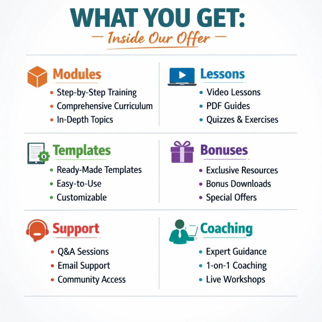
Think about your product or service as a collection of valuable pieces. If it’s an online course, what are the modules? What lessons are in each module? Are there worksheets, templates, or bonus guides? If it’s a service, what exactly does it include? How many sessions? What deliverables? List each component clearly.
Use bullet points or numbered lists to make this information easy to digest. People scan sales pages, and clear lists help them quickly grasp everything they’re getting.
Don’t just say “comprehensive training”; instead, say “Module 1: Mastering Your Mindset (3 video lessons, 2 worksheets).” This level of detail is reassuring.
For each component, briefly explain its purpose and how it contributes to the overall solution. Connect it back to the benefits you’ve already discussed.
For example, if you list “Exclusive Community Access,” explain that the benefit is “Get ongoing support and network with like-minded individuals.” This reinforces the value of each piece.
It helps the customer see that every part of your offer is designed to help them achieve their desired outcome.
This is also a great place to highlight any bonuses or extra resources that add significant value. Bonuses can often be the deciding factor for someone on the fence.
Consider using visual aids in this section. Screenshots of your course platform, mock-ups of your templates, or images of your physical products can make this section much more engaging.
Seeing is believing. If you have different tiers or packages, clearly outline what’s included in each.
Use comparison tables if necessary. This helps customers choose the option that best fits their needs.
The goal is to eliminate any confusion about what they are purchasing. The more clearly you break down what’s inside, the more confident your customer will feel about making a purchase decision.
Tip#9 Handle Objections
Even after you’ve presented a compelling solution, shown all the benefits, and backed it up with social proof, some potential customers will still have doubts. These doubts are called Objections.
They are the reasons someone might hesitate to buy. It’s crucial to address these objections directly on your sales page. Ignoring them is like leaving money on the table.
By anticipating and answering these questions, you build more trust and remove barriers to purchase. I always tell my clients: don’t wait for them to ask; answer their questions before they even think of them.
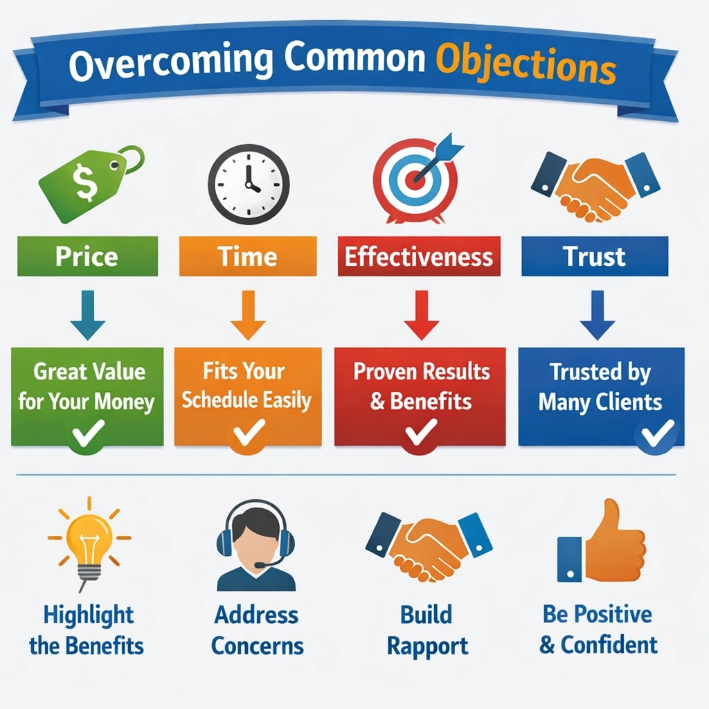
Common objections often revolve around price, time, effectiveness, or suitability.
For example, a customer might think: “It’s too expensive,” “I don’t have enough time,” “Will this really work for me?” or “Is this different from what I’ve already tried?”
Your sales page should have a dedicated section, often an FAQ (Frequently Asked Questions) or a specific section addressing concerns, where you tackle these head-on.
This shows that you understand their worries and have thought through their potential hesitations. It’s a proactive way to reassure them.
When handling objections, be honest and transparent. Don’t try to hide anything. If your product is a premium offering, explain why it’s worth the investment.
Focus on the long-term value and the return on investment. If time is a concern, highlight how your solution is designed to be efficient or how it will save them time in the long run.
For effectiveness, refer back to your social proof and case studies. Show them concrete examples of how it has worked for others.
For suitability, clearly define who your product is for and who it isn’t for. This helps the right people self-select and prevents dissatisfaction later.
It’s also helpful to reframe objections into benefits. For instance, if the objection is “It’s too expensive,” you could reframe it as “Consider the cost of not solving this problem.
Our solution is an investment that pays for itself many times over.” This shifts their perspective.
Use a reassuring and confident tone. You are the expert, and you are guiding them to the best decision.
A well-handled objection can actually strengthen a customer’s resolve to buy, as it shows your integrity and confidence in your offer.
Remember, every objection is a question seeking reassurance. By providing clear, concise, and empathetic answers, you guide your potential customer closer to making a confident purchase.
This section is not about arguing; it’s about understanding and alleviating concerns. It’s the final push that helps them overcome their last doubts and click that buy button.
Tip#10 Add a Strong Call to Action (CTA)
You’ve done all the hard work: you’ve hooked your reader, shown them the problem, introduced your solution, highlighted the benefits, provided social proof, broken down what’s inside, and even handled their objections.
Now, there’s only one thing left to do: Add a Strong Call to Action (CTA). This is the moment you tell your reader exactly what you want them to do next.
It’s the button they click, the form they fill out, or the link they follow to take the next step.
Without a clear and compelling CTA, all your previous efforts might be wasted. I always tell my clients: don’t make them guess; tell them precisely what to do.
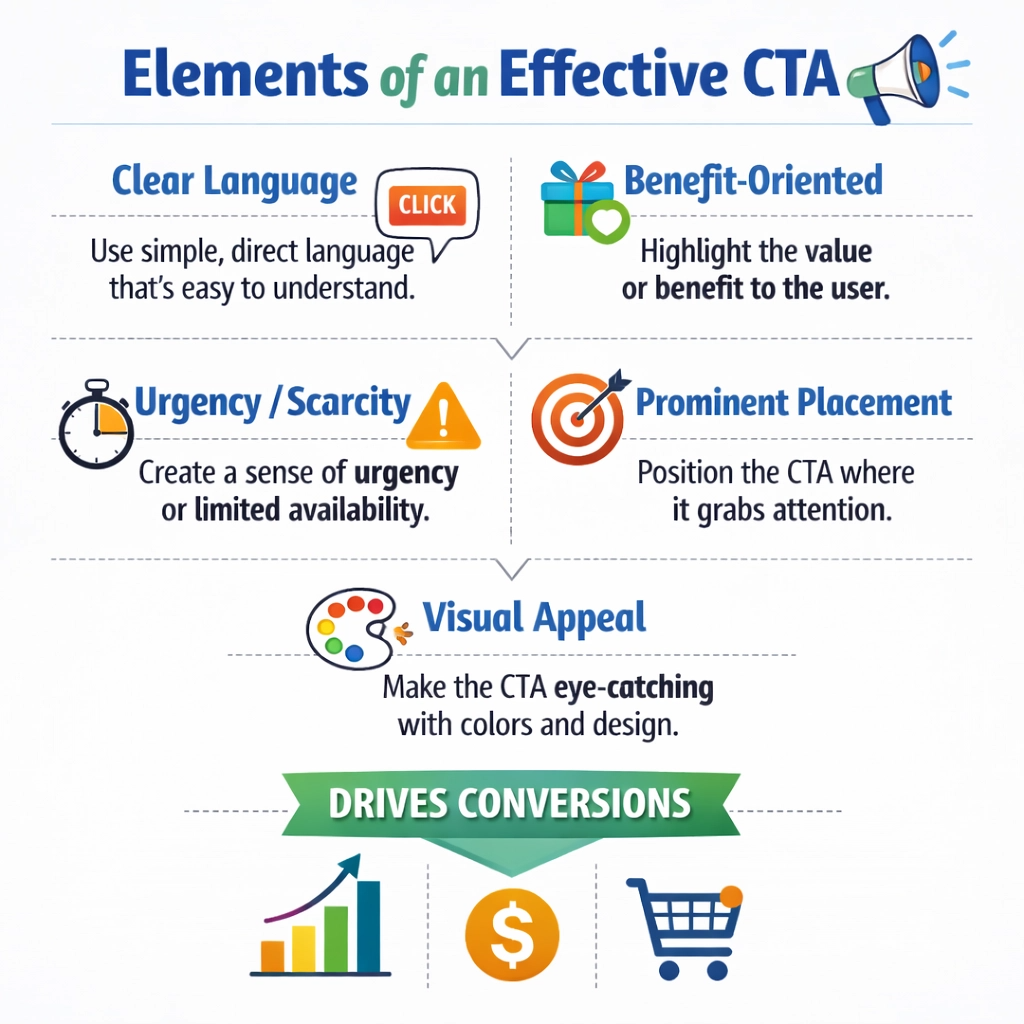
A strong CTA is clear, concise, and action-oriented. It uses verbs that tell the reader what action to take.
Instead of vague phrases like “Click Here,” use something more specific and benefit-driven, such as “Get Instant Access,” “Enroll Now & Start Learning,” “Download Your Free Guide,” or “Book Your Strategy Call.”
The words you choose for your CTA button can significantly impact how many people click it. Make it irresistible.
The CTA should be easy to find. It should stand out visually on your sales page. Use contrasting colors, a larger font, and plenty of white space around it.
Placement is also key. Your sales page should have multiple CTAs. Don’t just put one at the very end.
Place them strategically throughout the page, especially after you’ve presented a strong benefit or handled a major objection.
This allows people to take action as soon as they are convinced. However, don’t overwhelm them with too many different CTAs.
Stick to one main action you want them to take. All CTAs should lead to the same desired outcome, which is usually the purchase or sign-up page.
Your CTA should also create a sense of urgency or scarcity, if appropriate. Phrases like “Limited Time Offer,” “Only 5 Spots Left,” or “Price Increases Soon” can motivate people to act now rather than later.
However, use these honestly and sparingly. False urgency can damage trust. The goal is to give them a gentle nudge, not to pressure them unfairly.
Reiterate the main benefit or the transformation they will experience right before the CTA. Remind them what they stand to gain by taking action.
Ultimately, your CTA is the gateway to your customer’s transformation. It’s the final push that converts a curious reader into a paying customer. Make it clear, compelling, and easy to act upon.
Test different wordings and colors to see what works best for your audience. A well-crafted CTA is the difference between a sales page that informs and one that converts.
Tip#11 Add a Guarantee
Even after you’ve presented a compelling solution, shown all the benefits, provided social proof, broken down what’s inside, and included a strong call to action, some potential customers might still feel a bit nervous.
They might wonder, “What if it doesn’t work for me?” or “Is this really worth my money?” This is where a Guarantee comes in.
A guarantee is your promise to the customer that your product or service will deliver on its claims.
It removes risk from their decision and builds immense trust. I always tell my clients that a strong guarantee shows you truly believe in what you’re selling.
Think about it from the customer’s perspective. They are about to spend their hard-earned money on something new. There’s always a little bit of fear involved.
A guarantee acts like a safety net. It tells them, “You have nothing to lose.” This confidence booster can be the final push they need to make a purchase.
It shifts the risk from the buyer to you, the seller. This makes the decision much easier for them.
It also signals that your product or service is high quality and that you stand behind it 100%.
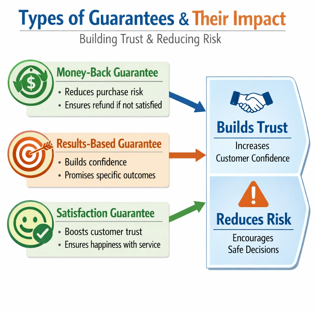
There are different types of guarantees. The most common is a money-back guarantee.
This means if they are not satisfied, they get their money back. You can specify the timeframe, like a “30-day money-back guarantee” or a “60-day satisfaction guarantee.”
Another type is a results-based guarantee. This promises a specific outcome, like “If you don’t get X result, we’ll work with you until you do.”
This type of guarantee is very powerful because it directly addresses their desire for transformation.
You can also offer a hybrid, combining both money-back and results-based elements.
When you offer a guarantee, make it clear, prominent, and easy to understand. Don’t hide it in tiny print at the bottom of your page.
Place it near your call to action or in a dedicated section. Use bold text and clear language.
Explain exactly what the terms are. What do they need to do to activate the guarantee? How long does it last?
Transparency here is key. A well-worded guarantee not only reduces perceived risk but also increases the perceived value of your offer. It shows you are confident, and that confidence is contagious.
Ultimately, a strong guarantee can significantly increase your conversion rates. It helps overcome that last bit of hesitation and makes your offer irresistible.
It’s a powerful tool for building trust and demonstrating your commitment to your customers’ success.
Don’t be afraid to offer a bold guarantee if you truly believe in your product. It will pay off in the long run by attracting more buyers and creating loyal customers.
Tip#12 Create Urgency
Even with a fantastic product, a compelling sales page, and a solid guarantee, some potential customers might still put off buying. They think, “I’ll do it later.” This is where you need to Create Urgency.
Urgency is a psychological trigger that encourages people to act now instead of procrastinating.
It gives them a good reason to make a decision quickly. Without urgency, many sales are lost because people simply forget or get distracted.
I always tell my clients that urgency isn’t about tricking people; it’s about helping them overcome inertia and seize an opportunity.
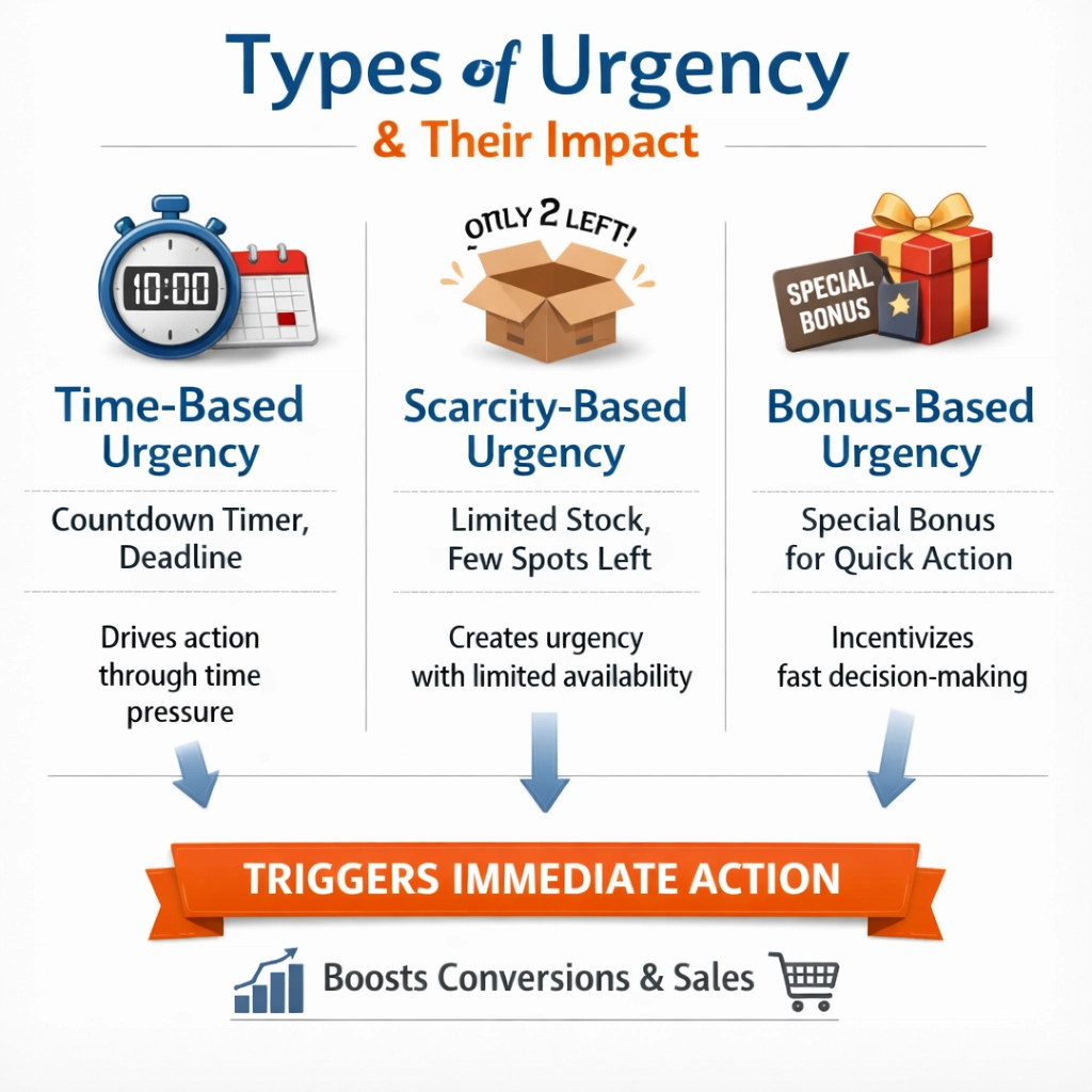
There are two main types of urgency: time-based and scarcity-based. Time-based urgency means the offer is only available for a limited period.
Phrases like “Offer Ends Soon,” “Last Chance to Save,” or “Enrollment Closes on [Date]” are examples.
You can use countdown timers on your sales page to visually reinforce this. This works well for launches or special promotions. Scarcity-based urgency means there’s a limited quantity of your product or service available.
Examples include “Only 10 Spots Left,” “Limited Edition,” or “While Supplies Last.” This is especially effective for coaching programs or physical products where numbers are naturally limited.
It’s crucial that any urgency you create is genuine. Don’t make up false deadlines or fake limited quantities.
This can damage your credibility and trust with your audience. If you say an offer ends on a certain date, make sure it actually ends. If you say there are only a few spots left, ensure that’s true.
Honesty builds long-term relationships. When your urgency is real, it becomes a powerful motivator. It helps people who are already interested to make that final decision.
Urgency works best when combined with a strong offer and clear benefits. If someone isn’t convinced your product is right for them, urgency won’t help. But if they are on the fence, a well-placed, genuine urgent message can tip them over.
You can also combine urgency with bonuses. For example, “Sign up in the next 24 hours and get a free bonus coaching session!” This adds extra incentive to act quickly.
The goal is to make the potential customer feel like they might miss out on something valuable if they don’t act now.
Remember, the purpose of creating urgency is to help your ideal customer take action on an offer that will genuinely benefit them. It’s about preventing procrastination, not about manipulation.
When used ethically and effectively, urgency can significantly boost your sales and help more people get the solution they need.
Conclusion
Creating a sales page that actually works doesn’t have to be a mystery. As we’ve explored in this guide, it’s about following a proven structure that guides your reader on a journey.
We started with the importance of a Powerful Headline to grab attention instantly, followed by a Subheadline to clarify your promise.
Then, we discussed how crucial it is to Identify the Problem so your reader feels understood, before you Introduce the Solution as the perfect answer to their struggles.
From there, we learned to Show the Benefits rather than just listing features, painting a picture of a better future.
We also covered how to Add Visual Elements to make your page engaging and easy to read.
To build trust, we explored how to Add Social Proof with testimonials and case studies.
We then made sure to clearly Break Down What’s Inside so buyers know exactly what they are getting.
Finally, we tackled how to proactively Handle Objections, Add a Strong Call to Action (CTA) to guide their next step, Add a Guarantee to remove risk, and Create Urgency to encourage immediate action.
Each of these elements plays a vital role. When you put them all together, you create a seamless, persuasive experience that turns curious visitors into confident buyers.
You don’t need to be a professional copywriter to succeed; you just need to understand your customer and follow this template.