Creating a sales page from scratch is overwhelming. You know your product is amazing, but converting visitors into customers feels impossible.
Most pages fail because they lack structure, miss critical psychological triggers, or distract visitors with unnecessary elements. What if you had a proven blueprint? A sale page template is your secret weapon.
In this guide, I’ll reveal the exact 8-section framework used by top-converting brands like Dinnerly and Future. You’ll discover why sales pages convert twice as many visitors as standard product pages, learn the psychology behind each section, and get actionable best practices.
By the end, you’ll have everything needed to build high-converting sales pages that turn browsers into buyers.
What is a Sale Page Template?
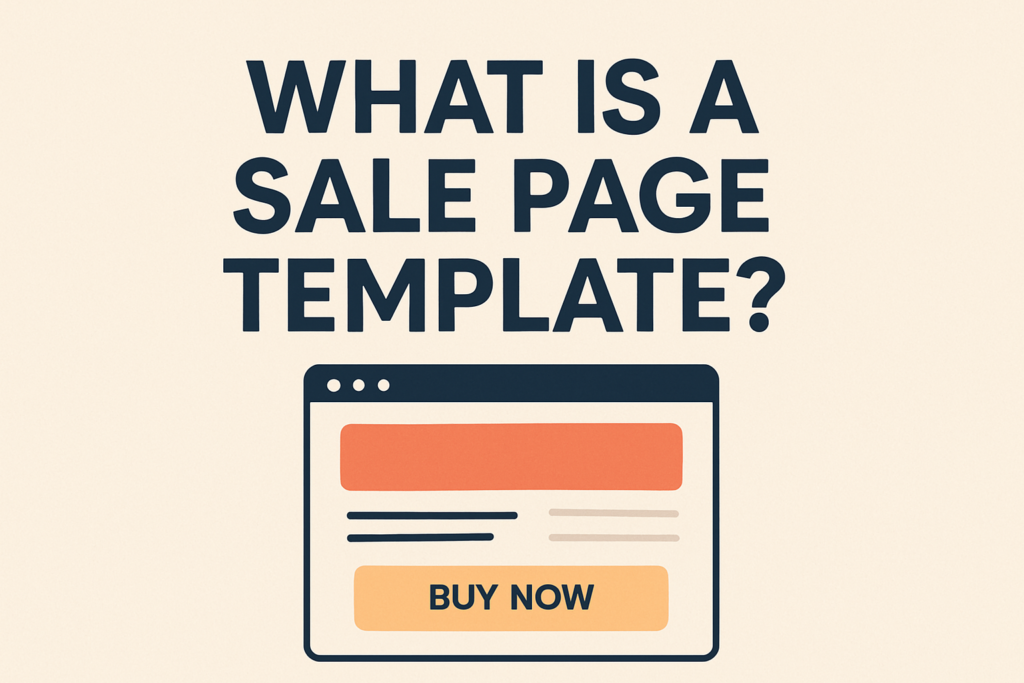
Let’s get one thing straight: a sale page template is not a magic wand. It’s a blueprint. Think of it like building a house. You wouldn’t just start nailing boards together randomly, would you? Of course not. You’d start with a blueprint that lays out the foundation, the rooms, the plumbing, and the electrical wiring. The blueprint ensures the house is structurally sound and functional. You still get to choose the paint colors, the furniture, and the decor to make it your own, but the core structure is based on proven architectural principles.
A sale page template does the same thing for your marketing. It provides the essential structure and flow, based on decades of research into consumer psychology and conversion rate optimization. It’s a fill-in-the-blanks framework that guides you through the process of creating a persuasive argument for your product. It ensures you don’t miss any critical elements, like a compelling headline, social proof, or a clear call-to-action.
Why is this so important? Because a dedicated sales page is fundamentally different from a regular page on your website. Your homepage has to serve many masters. It has to introduce your brand, direct people to different sections, and cater to a broad audience. A product page on an e-commerce site is often surrounded by distractions—navigation menus, links to other products, and company information. In fact, only 16% of landing pages are free of navigation bars, which means 84% are actively encouraging visitors to click away [1].
A sales page, born from a template, has one job and one job only: to convert. It’s a focused, distraction-free environment designed to guide a visitor toward a single action. This focus is incredibly powerful. Studies have shown that dedicated sales pages can convert twice as many visitors and double the average customer spend compared to a standard online store page [2]. By using a template, you’re not just saving time; you’re leveraging a proven system for achieving that singular goal.
The Anatomy of a High-Converting Sale Page Template
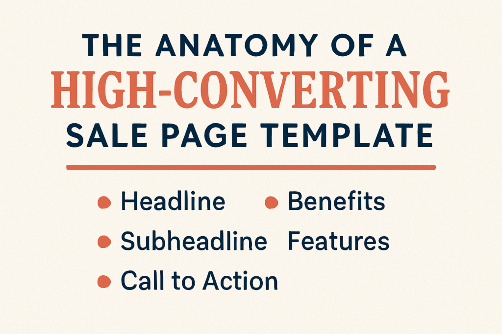
Now, let’s get into the nitty-gritty. What are the essential sections that make up a killer sales page? I’m going to walk you through the 8 key components of a high-converting sale page template. Think of these as the rooms in your blueprint. Each one has a specific purpose, and they all work together to create a seamless and persuasive experience for your visitor.
1. The Attention-Grabbing Headline & Hero Section
This is the first thing your visitor sees, and you have about three seconds to convince them to stay. Your headline is your first, and possibly only, chance to make an impression. It needs to be clear, compelling, and benefit-driven.
- Purpose: To grab the visitor’s attention and make a powerful promise that speaks directly to their biggest desire or pain point.
- Best Practices:
- Be Specific: Don’t say “Improve Your Marketing.” Say “Double Your Leads in 30 Days Without Spending a Dime on Ads.”
- Focus on the Outcome: What is the ultimate result they will get from your product?
- Use a Compelling Image or Video: The hero section should feature a high-quality visual that supports the headline. Interestingly, 73% of top landing pages feature human faces, which helps to build an immediate emotional connection [3].
Example: Ramit Sethi is a master of this. A headline for his course might be, “I Will Teach You To Be Rich,” a bold, confident promise that immediately grabs you. The hero section would feature a high-quality photo of him looking directly at the camera, building trust and authority.
2. The Problem & Agitation Section
Before you can present your solution, you have to make sure your visitor understands the problem. This section is where you show them that you “get it.” You understand their struggles, their frustrations, and their fears. You’re not just selling a product; you’re solving a real problem.
- Purpose: To connect with the visitor on an emotional level by describing the pain points they are currently experiencing.
- Best Practices:
- Use Their Language: Use the exact words and phrases your target audience uses to describe their problems. Scour forums, reviews, and social media for this language.
- Tell a Story: A relatable story about someone (maybe even yourself) who struggled with the same problem can be incredibly effective.
- Agitate the Pain: Gently rub salt in the wound. Remind them of the consequences of not solving this problem. What will happen if they continue on their current path?
Example: A sales page for a sleep aid might start by describing the feeling of tossing and turning at 3 a.m., the dread of the alarm clock, and the exhaustion that follows you throughout the day. It makes the problem feel real and urgent.
3. The Solution & Benefits Section
Now that you’ve agitated the problem, it’s time to introduce the solution: your product. But here’s the crucial part—don’t just list features. People don’t buy features; they buy outcomes. They buy a better version of themselves. This section is where you paint a vivid picture of what their life will look like after they use your product.
- Purpose: To introduce your product as the ultimate solution to the problem and to focus on the transformational benefits it provides.
- Best Practices:
- Translate Features into Benefits: For every feature, ask “so what?” The answer is the benefit. Feature: “Our course includes 10 video modules.” Benefit: “So you can learn at your own pace, on your own schedule, without ever having to leave your house.”
- Focus on Emotion: How will they feel after using your product? Confident? Relieved? Empowered? Secure? Use emotional language to connect with these feelings.
- Use Bullet Points: This is a great place to use benefit-driven bullet points. They are easy to scan and help break up the text.
Example: A sales page for a project management tool wouldn’t just say “Gantt charts and task dependencies.” It would say, “Finally, a way to see your entire project at a glance, so you can stop worrying about deadlines and feel in complete control.”
4. The Social Proof & Testimonials Section
This is arguably the most important section of your entire sale page template. Why? Because people don’t trust marketers; they trust other people. Social proof is the evidence that your product actually works for real people. It’s the ultimate trust-builder.
- Purpose: To build credibility and trust by showing that other people have used and loved your product.
- Best Practices:
- Use a Variety of Formats: Don’t just use written quotes. Include video testimonials, screenshots of social media comments, case studies with real data, and logos of well-known companies you’ve worked with. Adding a customer testimonial can increase conversions by a staggering 34% [4].
- Be Specific: A testimonial that says “This product is great!” is nice, but it’s not very powerful. A testimonial that says “After using this product for 30 days, I increased my sales by 47%” is a conversion machine.
- Include Photos: Always include a photo of the person giving the testimonial. It makes it feel more real and relatable.
Example: The fitness app, Future, does this brilliantly. Their sales page is filled with before-and-after photos, video testimonials from real users, and quotes that highlight specific results, like “I’ve lost 25 pounds and have more energy than ever.”
5. The Offer & The Stack
This is where you lay out exactly what they’re going to get when they buy. You need to make your offer so irresistible that they feel like they’d be crazy not to take it. A great way to do this is with a “value stack.”
- Purpose: To clearly present your offer and stack the value to make the price seem like a bargain.
- Best Practices:
- List Everything: Don’t just list the core product. Include all the bonuses, the community access, the support, and anything else they get.
- Assign a Value to Each Item: Even if a bonus is a digital download, assign a real-world value to it. This makes the total value of your offer seem much higher than the price.
- Use Visuals: Create a graphic that visually represents the stack. This makes it more tangible and easier to understand.
Example: A digital course creator might stack their offer like this:
- The Core Course ($1,997 Value)
- BONUS: The Private Community ($997/year Value)
- BONUS: The Live Q&A Calls ($2,500 Value)
- BONUS: The Resource Library ($497 Value)
Total Value: $5,991
Your Price Today: Just $997
See how that works? It reframes the price and makes it feel like an incredible deal.
6. The Call-to-Action (CTA) & Pricing
This is the moment of truth. You’ve made your case, and now it’s time to ask for the sale. Your CTA needs to be clear, direct, and impossible to miss.
- Purpose: To get the visitor to take the desired action (i.e., buy your product).
- Best Practices:
- Use a Contrasting Color: Your CTA button should be the most visually prominent element on the page.
- Use Action-Oriented Language: Instead of “Submit,” use phrases like “Get Instant Access,” “Start Your Transformation,” or “Join Now.”
- Offer Payment Options: If it’s a high-ticket item, offering a payment plan can significantly increase conversions.
- Personalize it: Personalized CTAs have been shown to perform 202% better than generic ones [5]. If you can, use dynamic text to include the visitor’s name or company.
Example: Instead of a boring “Buy Now” button, try something like, “Yes, I’m Ready to Double My Leads!” It’s benefit-driven and creates a sense of excitement.
7. The Guarantee & Risk Reversal
No matter how great your offer is, people will always have some level of fear or skepticism. What if it doesn’t work for them? What if they don’t like it? A strong guarantee removes that risk and makes it a no-brainer to buy.
- Purpose: To eliminate the visitor’s fear of making a bad decision and build trust.
- Best Practices:
- Make it Unconditional: A “30-day, no-questions-asked, money-back guarantee” is the gold standard. The more confident you are in your product, the stronger your guarantee can be.
- Give it a Name: Instead of just a “guarantee,” call it something like “Our ‘You’ll Love It or It’s Free’ Promise.”
- Make it Prominent: Don’t hide your guarantee in the fine print. Make it a key part of your offer.
Example: “Try the entire course for 60 days. If you don’t see a dramatic improvement in your sales, just send us an email, and we’ll refund every penny. No hoops to jump through, no questions asked.”
8. The FAQ & Final CTA
Even after reading your entire sales page, some people will still have questions. The FAQ section is your chance to address these last-minute objections and give them the final push they need to buy.
- Purpose: To answer common questions and overcome any lingering objections.
- Best Practices:
- Think Like Your Customer: What are the most common questions you get about your product? What are the reasons people give for not buying?
- Keep it Concise: Answer each question clearly and directly.
- End with a Final CTA: After you’ve answered their questions, give them one last chance to buy. Place another CTA button at the end of the FAQ section.
Example: Common FAQ questions might include: “How long will I have access to the course?” “What if I’m a complete beginner?” “Is there a payment plan?”
Putting It All Together: A Real-World Example
Let’s look at how a brand like Dinnerly, the meal kit service, uses these elements in their sales page.
- Headline: “The Most Affordable Meal Kit” – Clear, specific, and addresses a major pain point (cost).
- Problem: They show images of busy people who don’t have time to cook, highlighting the stress of meal planning.
- Solution: They present their meal kits as the easy, affordable solution, with photos of delicious, easy-to-make meals.
- Social Proof: They feature testimonials from happy customers and logos of media outlets that have featured them.
- Offer: They clearly lay out their pricing options and any introductory offers.
- CTA: A prominent “Get Started” button that follows you down the page.
- Guarantee: They offer a satisfaction guarantee, promising to make it right if you’re not happy with a meal.
- FAQ: They have a comprehensive FAQ section that answers questions about delivery, ingredients, and customization.
By following this proven sale page template, Dinnerly creates a persuasive and effective sales experience that has made them one of the most popular meal kit services on the market.
Your Turn to Build a Conversion Machine
I know this might seem like a lot, but don’t be intimidated. The beauty of a sale page template is that it breaks down a complex process into manageable steps. You don’t have to reinvent the wheel; you just have to follow the blueprint.
Start by outlining these 8 sections for your next product launch. Fill in the blanks. Use the best practices I’ve shared. And most importantly, test everything. A/B test your headlines, your CTAs, your pricing. The data will tell you what’s working and what’s not.
The average conversion rate for a landing page is around 6.6% [6]. But with a well-crafted sales page based on a proven template, you can do much, much better. I’ve seen pages built with this exact framework achieve conversion rates of 10%, 15%, or even higher.
So, stop staring at that blank screen. Take this template, make it your own, and start building the sales pages that will take your business to the next level. You’ve got this.
The Unspoken Rule of Sales Page Design
While the copy and structure of your sales page are critical, they can only take you so far. If the design is cluttered, confusing, or slow, your visitors will leave before they even have a chance to read your brilliant copy. In the world of online sales, user experience (UX) is not just a nice-to-have; it’s a necessity. The average bounce rate for landing pages is a staggering 70-90% [1]. That means for every 10 people who land on your page, 7 to 9 of them leave without taking any action. A poor user experience is often the culprit.
The Need for Speed
In our instant-gratification world, patience is a virtue that few possess. If your page takes more than a few seconds to load, you’ve already lost a significant portion of your audience. In fact, a 1-second delay in page load time can result in a 7% reduction in conversions. For an e-commerce site making $100,000 per day, that 1-second delay could cost over $2.5 million in lost sales every year.
- How to fix it:
- Optimize your images: Use tools like TinyPNG or ImageOptim to compress your images without sacrificing quality.
- Leverage browser caching: This stores parts of your page in a visitor’s browser so it doesn’t have to be reloaded every time they visit.
- Use a Content Delivery Network (CDN): A CDN stores copies of your page on servers around the world, so it loads faster for visitors regardless of their location.
Mobile-First is a Must
More than half of all web traffic now comes from mobile devices. If your sales page is not optimized for mobile, you’re alienating more than half of your potential customers. A mobile-responsive design is no longer optional; it’s essential. Mobile-responsive landing pages have a conversion rate of 11.7%, while desktop-only pages lag behind at 10.7% [1]. That may not seem like a huge difference, but over thousands of visitors, it adds up.
- How to fix it:
- Use a responsive design: Your page should automatically adjust to fit any screen size.
- Keep it simple: Mobile screens are small. Use a single-column layout, large fonts, and plenty of white space.
- Make your buttons thumb-friendly: Your CTA buttons should be large enough to be easily tapped with a thumb.
The Power of Visuals
They say a picture is worth a thousand words, and on a sales page, it might be worth a thousand sales. High-quality, relevant visuals can make your page more engaging, easier to understand, and more persuasive. But not all images are created equal. Using a stock photo of a smiling person in a business suit is not going to cut it. In fact, one A/B test showed that replacing a generic stock photo with a photo of an actual student increased form submissions by a whopping 161% [1].
- How to fix it:
- Use real photos: Use photos of your actual customers, your team, or your product in action.
- Use video: Adding a video to your landing page can increase conversions by up to 86% [1]. A short video that explains your product or features a customer testimonial can be incredibly powerful.
- Use color strategically: Use colors that are consistent with your brand and that evoke the right emotions. For example, blue is often associated with trust and security, while red can create a sense of urgency.
By focusing on these three key areas of user experience—speed, mobile optimization, and visuals—you can create a sales page that not only looks great but also performs like a well-oiled conversion machine. Remember, the goal is to make it as easy and enjoyable as possible for your visitors to say “yes” to your offer.
We’ve barely scratched the surface of sale page template, with it having much more going on. There’s a reason it made it onto our digital product guide , and we highly recommend you check it out.
References
[1] VWO. (2025, April 29). Top 40+ Landing Page Statistics to Boost Your Marketing Strategy. https://vwo.com/blog/landing-page-statistics/
[2] Unbounce. (2025, February 15). How to create sales pages that convert (+ 8 sales page examples). https://unbounce.com/landing-page-examples/high-converting-sales-pages/
[3] ChartMogul, as cited in VWO. (2025, April 29). Top 40+ Landing Page Statistics to Boost Your Marketing Strategy. https://vwo.com/blog/landing-page-statistics/
[4] VWO. (n.d.). WikiJob’s landing page conversions increased by 34% after adding a customer testimonial. https://vwo.com/success-stories/wikijob/
[5] HubSpot. (n.d.). Personalized CTA elements perform 202% better than regular ones. https://www.hubspot.com/marketing-statistics
[6] Unbounce. (2025, March 4). What is the average landing page conversion rate? (Q4 2024 data). https://unbounce.com/average-conversion-rates-landing-pages/


